When: 2010
Who: Self initiated
Following our statement Good Design is Not Bling we should put our design where our mouth is, or at least demonstrate what we mean.
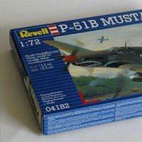
As an example we're going to use the packaging of a model kit for the simple reason that these are solidly stuck in convention, we have never seen a re-thinking of the main stream model kit box graphics, they have remained the same for ages, so what better victim for a small redesign/re-imagining project, than the good old model kit box - something that was an integral part of young Kenn's childhood holidays spent in Sweden - You see, Kenn's dad would always bring a few model kits along, in case of rainy days. And one thing was certain: The finished model was always pretty far from the pretty image on the box.
The illustrations on the box are always a painting, never a photo of a finished model - now, there's a lie already, or a secret anyway. The model kits "sell" you the idea that you can make this perfect replica of - in this case - a P-51B Mustang, sure, it would take a bit of work and skill, but you could do it. So the focus is on this fantasy, why not focus on the joy of building something with your dad in a cabin in rainy Sweden?
In this project we will not sell a fantasy, we will sell an experience. Our approach will focus on what you actually get, which is a hobby-project and the joy of creating something, at the same time we will attempt to make this experience as positive as possible.
Revell is a copyrighted trademark and we are only using it here as an example. this project is not endorsed by Revell.
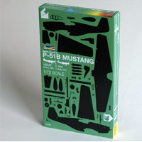
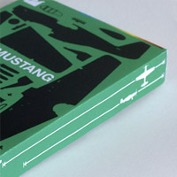
We have refrained from redesigning the actual "container" as there's enough to do on the graphics, we have just made the box a bit smaller and more elegant - the sprues with the parts will still fit in and there's no point in a waaay to big box, it will only lead to disappointment, and we're not selling disappointment in this excercise.
Logos are normally big boys on these boxes, but none of the manufactureres seem to want to position themselves differently than the others, the boxes more or less all look the same. We have turn the box into a striking identity so we can do with a more discreet logo - the box is the logo. Only experienced model buiders will have brand preferences and they will know the brands in a geeky market so there is no point in having a dominating logo.
We like geeky markets.
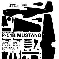
Arguably, the most important information is that this is a model kit, we let the depiction of every single part of the kit explain this, as mentioned earlier, we're intending to change the whole concept of what we're selling here.
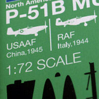
The second most important information must be what this is a model kit of - we go for the name. We are not showing the finished model, as we want to influence the building experience itself: The model will develop in front of your eyes, think of it as unwrapping a present in reverse.
Next in the hierarchy of importance is scale, so we write the scale. We thought about showing scale, but it's not feasable in small scales.
Agreed, the logo is still pretty dominant in our version - we're still rooted in reality and clients often want their logo bigger, sometimes even for the right reasons: That they're proud to put their name on the product.
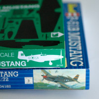
The existing box mentions the size of the finished model, a good idea as the size of the box itself, as mentioned, can be deceptive. We'll nick this idea for our redesign, thank you very much. But there is a better way to show the size of the final model than to just write down the measurements, numbers like that can be deceiving if you have not got a ruler with you and, let's face it; you don't.
On the side of the box in what's the smallest type on the entire packaging, it is mentioned that you can in fact choose between two different versions of the plane: An American USAAF version and a British RAF version, this information is definitely front-of-box stuff, so that's where we'll put it.
Oh, and why not educate the kids on a bit of history while we're at it, we add the year and place of service to the information.
No, I didn't know that the US army were in China in '45 either.
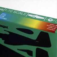
Model kits are not fun if you mess it up, so Revell has put a difficulty rating on the box ranging from 1 to 5, big surprise: We have an alternative! On a very rare occassion like this, an Adobe Illustrator gradient makes perfect sense. This floating range allows for a more precise rating of the models. And the shelves in the shop will become a great, big version of our gradient.
Contrary to most toys, model kit boxes don't nessecarily contain everything you need, looking through the instructions, we learn that you need specific tools, paints and glue. This information is only found in the instructions inside the box so you will not know which supplies you'll need.
This information needs to be on the box.
Us humans - we are a curious species, if we see an object that appeals to us and intrigues us, we will want to touch it and that is one of the most important purposes of a piece of packaging, to get us to touch it, turn it around in our hands, introduce itself and allow us to get to know it and its contents.
We don't want to have all the information on the front of the box, though. So instead we are tapping into the curiosity of the potential buyer and direct him or her around the packaging for crucial information about tools and supplies they need in order to avoid disappointment if they buy the product.
The original box actually mentions three essential colours but in very small type. This is not a bad idea, the instructions inside have more colours, but the ones mentioned on the box are what you could do with, if you're not trying to create something that looks like the illustration on the box. Strangely enough the instruction then don't tell you about this simpler paint scheme - also, the colours mentioned on the box are only for the USAAF fighter, as the kit allows you to build either a British or an American version of the plane - each with a different paintjob, you might end up bying paints you won't need if you simply buy them all, so that has to be explained too.
Well, We'll include them all for both versions and using the colour coding we'll make a distinction between the simple approach and the advanced colorscheme.
It's been an interesting little day-project do redesign the information on this box, but is our version any better? We think it is, it's honest and it's a new approach in a market where the design doesn't seem to have changed much since the 60'ies - mind you, there are a few companies that are doing interesting things, but these are all targeted at master modelmakers.
Our approach of shifting the product's focus from "get a replica of a plane" to "Have fun creating something" demonstrates the huge potential of packaging as media and that was a great part of this excercise.
Would this sell better in the shops? Probably not. The inobtainable fantasy will always win. But our version takes a step - if not a leap - closer to the true essence of the product and actually changes the function of the product inside, focussing on the journey rather than the goal and that's pretty powerful stuff for some colours on a piece of cardboard.