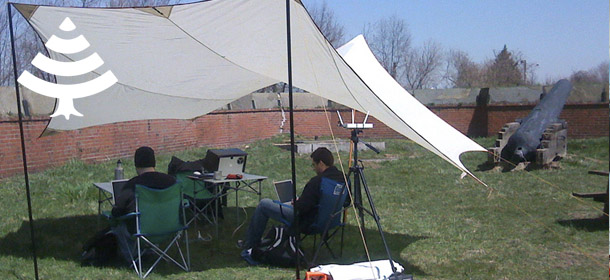

This little high-tech nature-loving logo was designed for Coworkout - a group of people refusing to accept the way we work, they pack their gear and head outside to get that fresh air our mums said we should get instead of sitting in front of computers, tellies and so on.
The logo got the nickname "Wi-Fir" during the process, see the story of the Gearxel for an explaination of why naming logos is important.
Not 100 percent sure that the mac way of showing Wi-FI signal strength is universal, but it's pretty safe to say that the people who get that other people want to work of the interweb outside will understand this logo.
The brief called for a logo that would fit in a square and preferably would be able to make a stencil of and therefore, knowing the client, it'll just be a matter of time before this is seen spraypainted on something made of metal and painted green, probably a halftrack...