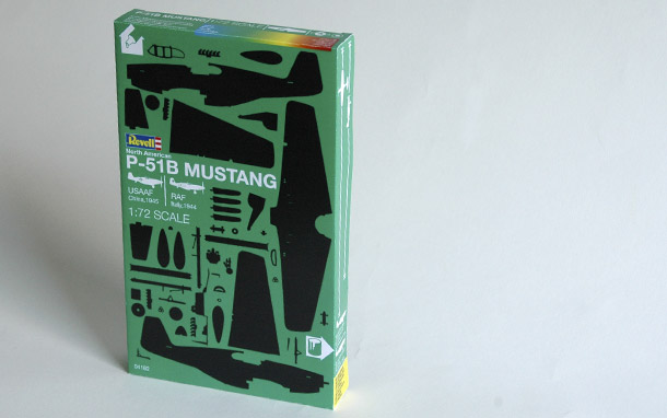

Thinking about the outside of the box
We have refrained from redesignng the actual "container" as there's enough to do on the graphics, we have just made the box a bit smaller and more elegant - the sprues with the parts will still fit in and there's no point in a waaay to big box, it will only lead to disappointment, and we're not selling disappointment in this excercise.
Logos are normally big boys on these boxes, but none of the manufactureres seem to want to position themselves differently than the others, the boxes more or less all look the same. We have turn the box into a striking identity so we can do with a more discreet logo - the box is the logo. Only experienced model buiders will have brand preferences and they will know the brands in a geeky market so there is no point in having a dominating logo.
We like geeky markets.
Arguably, the most important information is that this is a model kit, we let the depiction of every single part of the kit explain this, as mentioned earlier, we're intending to change the whole concept of what we're selling here.
The second most important information must be what this is a model kit of - we go for the name. We are not showing the finished model, as we want to influence the building experience itself: The model will develop in front of your eyes, think of it as unwrapping a present in reverse.
Next in the hierarchy of importance is scale, so we write the scale. We thought about showing scale, but it's not feasable in small scales.
Agreed, the logo is still pretty dominant in our version - we're still rooted in reality and clients often want their logo bigger, sometimes even for the right reasons: That they're proud to put their name on the product.
Next: Size matters